Blog Post #6 - Ground Game
Introduction
Throughout the 21st Century, turnout across the United States has fluctuated significantly. For the sake of this blog post, voter turnout is described as the % of the amount of voters vs. the voting eligible population (18+ & have the ability to vote). Taking data from the University of California Santa Barbara’s American Presidency Project, which collects data pertaining to presidential elections, we find that in the 2000 election, voter turnout was just 55.3%. Based on ElectProject.org, in the 2020 election, voter turnout was 66.6%; the highest since the 1900 presidential election.
However, our focus is on the 2022 midterm elections & understanding the impact of turnout on congressional races. For the sake of context, turnout in 2018 was 50.0%, contrary to 2014’s turnout at 36.7%. Both of these races have something in common: they are midterm elections. Midterm elections rarely rival presidential election turnout — but when they do, elections become significantly more interesting.

The old rule of thumb was that increasing turnout meant an increase in Democratic vote share. Many pundits have been under the assumption that democrats rely heavily on turnout in order to win their elections, whereas republicans are the baseline winners. Taking 2014 & 2018 for instance — 2014 was an overwhelming red wave year, where Democrats were far from enthused & didn’t turnout. 2018, on the other hand, was a significantly high turnout year, in which Democrats won back control of the House of Representatives. Though, it is not that simple.

In this blog, we will be exploring the impact of turnout on the midterm elections, though we will be considering more than just that. In addition to turnout, we will be mapping our data based on expert predictions and incumbency. In this blog post, we will be utilizing 2018 as our data point — given that we are only using data for all 435 districts for 2018. For incumbency, we will be treating that as a factor by congressional district, denoting incumbency by the incumbent party in the district (even if the race is an open seat). Finally, our expert predictions will be taken from the Cook Political Report, Larry Sabato’s Crystal Ball, and Inside Elections.
Background on 2018 Midterm Elections
To start, here are 2 maps of the 2018 midterm election results, as a baseline to see the election results. The first will show the margin of Democratic Party vote share, whereas the other will show the election winner in red or blue.## Warning in sprintf("https://cdmaps.polisci.ucla.edu/shp/districts114.zip", :
## one argument not used by format 'https://cdmaps.polisci.ucla.edu/shp/
## districts114.zip'## Warning in sprintf("districtShapes/districts114.shp", cong): one argument not
## used by format 'districtShapes/districts114.shp'## Reading layer `districts114' from data source
## `/private/var/folders/15/62drzq6146bd63l1qfb1btkr0000gn/T/RtmpRnIk6r/districtShapes/districts114.shp'
## using driver `ESRI Shapefile'
## Simple feature collection with 436 features and 15 fields (with 1 geometry empty)
## Geometry type: MULTIPOLYGON
## Dimension: XY
## Bounding box: xmin: -179.1473 ymin: 18.91383 xmax: 179.7785 ymax: 71.35256
## Geodetic CRS: NAD83## Rows: 16067 Columns: 31
## ── Column specification ────────────────────────────────────────────────────────
## Delimiter: ","
## chr (16): Office, State, Area, RepCandidate, RepStatus, DemCandidate, DemSta...
## dbl (14): raceYear, RepVotes, DemVotes, ThirdVotes, OtherVotes, PluralityVot...
## lgl (1): CensusPop
##
## ℹ Use `spec()` to retrieve the full column specification for this data.
## ℹ Specify the column types or set `show_col_types = FALSE` to quiet this message.
## `summarise()` has grouped output by 'district_num', 'State', 'district_id'. You can override using the `.groups` argument.## [1] 22.80 64.41 49.59 50.62 38.84 68.25## Registered S3 method overwritten by 'geojsonlint':
## method from
## print.location dplyr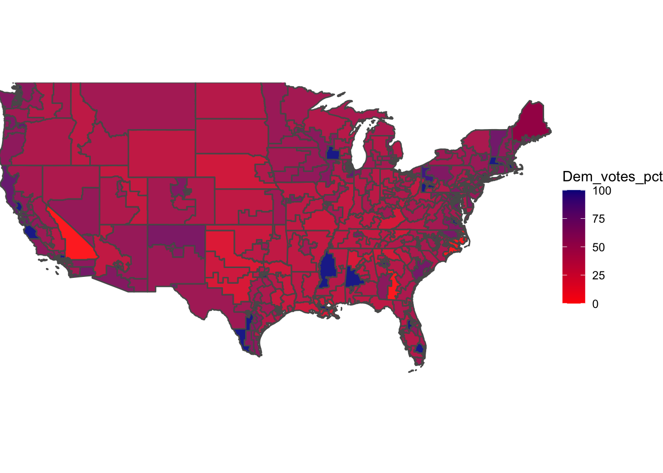
## [1] (0,50] (50,100] (0,50] (50,100] (0,50] (50,100]
## Levels: (0,50] (50,100]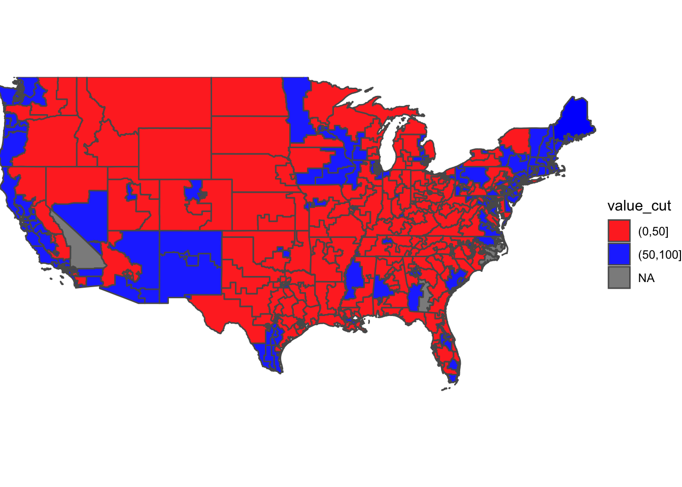 Note on the map above: some of the districts are grayed out (only 3), this is due to a data error not being captured by the R code mapping the districts. These are all Republican victories – please view them as such.
Overall, Democrats captured 235 House seats, to the Republican Party’s 199. This was the most recent midterm election result.
Model on expert prediction
Now, we move onto expert predictions for 2018 & see what worked versus did not. Here is a map of the 2018 predictions on the House level.
## [1] 7.000000 1.000000 3.666667 3.666667 3.666667 3.666667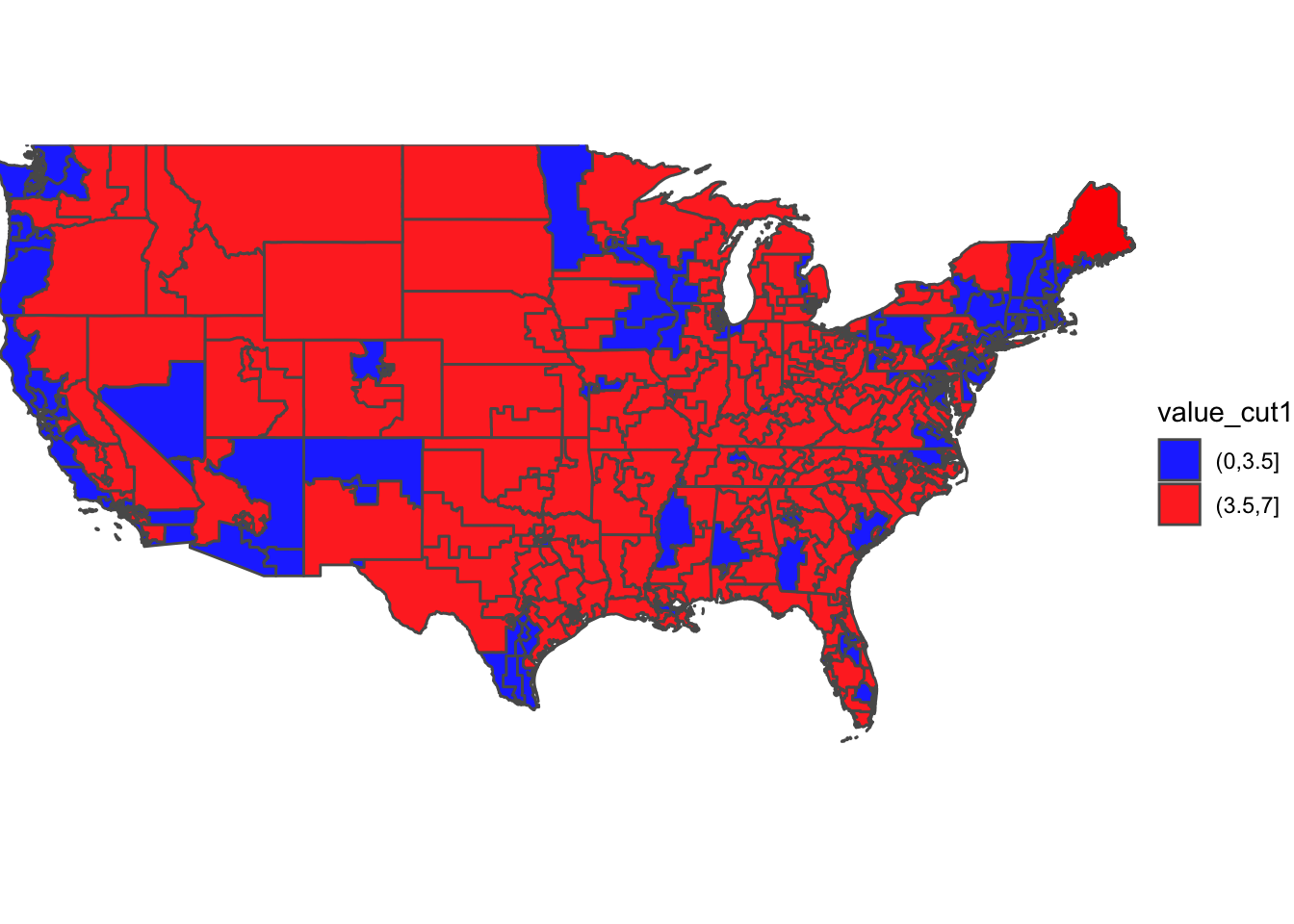
## Loading required package: gridExtra##
## Attaching package: 'gridExtra'## The following object is masked from 'package:dplyr':
##
## combine
Based on the results above, we find that expert predictions are not too far off from reality. The results vs. the expected are nearly identitcal – with very similar maps. There are some differences, but ultimately, expert predictions are quite reliable.
Unfortunately, expert predictions are not always going to be the most “ethical” way to go about political predictions. In a sense, it is cheating, as the factors we include, such as GDP growth, presidential approval, incumbency, etc. are all taken into account through the expert forecasts. Thus, if we create a forecast with 5-10 variables impacting the prediction, while including an expert rating that already does that, we could be over-doing the forecast. Though, expert predictions on its own, could be fascinating to explore.
Ironically, we are going to move into expert predictions + incumbency as it pertains to Dem vote share.
Model including incumbency + expert predictions
To begin, let’s explore the correlation between the ratings from political firms & the Democratic Party’s vote share:
##
## Call:
## lm(formula = Dem_votes_pct ~ avg, data = expertratings)
##
## Residuals:
##     Min      1Q  Median      3Q     Max
## -34.557  -7.208  -0.767   5.473  24.972
##
## Coefficients:
##             Estimate Std. Error t value Pr(>|t|)
## (Intercept)  81.7734     0.9238   88.52   <2e-16 ***
## avg          -6.7452     0.1982  -34.04   <2e-16 ***
## ---
## Signif. codes:  0 '***' 0.001 '**' 0.01 '*' 0.05 '.' 0.1 ' ' 1
##
## Residual standard error: 11.05 on 434 degrees of freedom
## Multiple R-squared:  0.7275, Adjusted R-squared:  0.7268
## F-statistic:  1159 on 1 and 434 DF,  p-value: < 2.2e-16
Based on the found R^2 of 0.7275, we can conclude that there is correlation between Democratic Party vote share and expert rating. This correlation indicates that expert ratings are good at providing helpful insight into the outcome of elections on the Congressional level.
At this point in the blog post, we will be shifting from predictions, to rather analyzing the correlation between our extended variables and the 2018 election results. This is because I do not plan to include any of the future variables in my final prediction – however, knowing how they are connected to Democratic Party vote share is equally fascinating as it is important. Now, let’s throw in the factor of incumbency into the mix in addition to expert predictions:
##
## Call:
## lm(formula = Dem_votes_pct ~ avg + IncumbentParty, data = newdatafr)
##
## Residuals:
##     Min      1Q  Median      3Q     Max
## -34.948  -6.166  -0.558   5.257  24.224
##
## Coefficients:
##                Estimate Std. Error t value Pr(>|t|)
## (Intercept)     81.5211     0.9145  89.144  < 2e-16 ***
## avg             -5.7455     0.3667 -15.666  < 2e-16 ***
## IncumbentParty  -6.3544     1.9724  -3.222  0.00137 **
## ---
## Signif. codes:  0 '***' 0.001 '**' 0.01 '*' 0.05 '.' 0.1 ' ' 1
##
## Residual standard error: 10.92 on 435 degrees of freedom
## Multiple R-squared:  0.7334, Adjusted R-squared:  0.7322
## F-statistic: 598.4 on 2 and 435 DF,  p-value: < 2.2e-16
The R^2 in this was 0.7334, which was an increase from the previous R^2 value under just expert predictions. By adding in the incumbent party (currently holding the seat), the R^2 shows a clear correlation between the two variables when added together. This is to be expected, as mentioned previously, as expert predictions practically cover forecasters on many fronts.
I expect it to be the same as we add in the factor of turnout.
Model including incumbency + expert predictions + turnout
Before we look at turnout, I want to plot a simple map of turnout by congressional district in 2018, just for additional context.
## [1] 0.43 0.54 0.49 0.49 0.54 0.54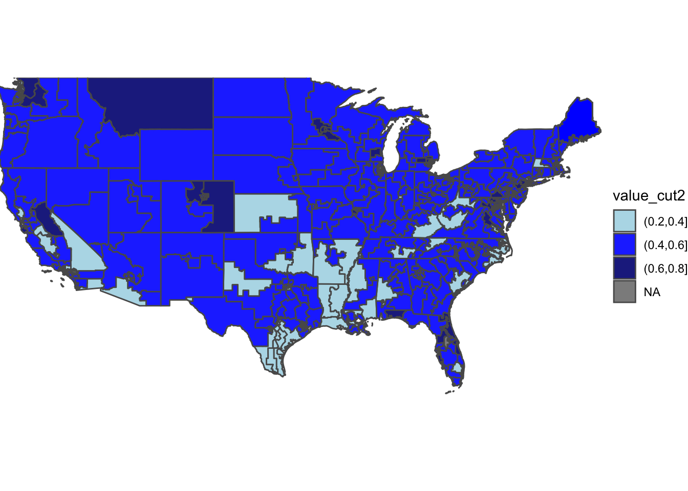 As shown in the map, most congressional districts experienced turnout between 40%-60%. This puts the majority of our districts within a similar turnout rate, thus making it more difficult to use it as a predictor. Despite the majority being 40%-60%, there are some extremely high turnout districts, such as Montana’s At-Large District, with 60%-80% turnout. Some, however, are on the flip side of low turnout: such as Texas’s 34th District, betwene 20%-40%. Main takeaway from this map: turnout is pretty standard when sectioned into blocks.
Let’s run a linear regression model to find the correlation between Dem vote share & incumbency + turnout + expert predictions! The big 3!
##
## Call:
## lm(formula = Dem_votes_pct ~ avg + IncumbentParty + turnout,
##     data = newdatafr)
##
## Residuals:
##     Min      1Q  Median      3Q     Max
## -44.733  -6.700   0.244   5.981  27.275
##
## Coefficients:
##                Estimate Std. Error t value Pr(>|t|)
## (Intercept)      97.545      2.583  37.757  < 2e-16 ***
## avg              -5.990      0.352 -17.016  < 2e-16 ***
## IncumbentParty   -3.692      1.926  -1.917   0.0558 .
## turnout         -34.236      5.195  -6.590 1.28e-10 ***
## ---
## Signif. codes:  0 '***' 0.001 '**' 0.01 '*' 0.05 '.' 0.1 ' ' 1
##
## Residual standard error: 10.43 on 434 degrees of freedom
## Multiple R-squared:  0.7577, Adjusted R-squared:  0.756
## F-statistic: 452.4 on 3 and 434 DF,  p-value: < 2.2e-16
In the above model, the R^2 was found to be 0.756. This is quite significant in terms of correlation, showing how there is a correlation between incumbency, expert predictions, AND turnout. All 3 of the factors increase the correlation between the variables – getting it closer to 1, each time we added a new variable.
Unfortunately, I will not be using turnout or incumbency in my final prediction, but for my 2022 forecast, I am now considering using expert predictions. Here is my prediction based on that:
## # A tibble: 141 × 8
##     year state     district sabatos_crystal…  cook rothenberg avg_csi prediction
##    <dbl> <chr>     <chr>               <dbl> <dbl>      <dbl>   <dbl>      <dbl>
##  1  2022 Alaska    AL                      4     4       4.75    4.25       50.4
##  2  2022 Arizona   1                       5     4       5.5     4.83       48.9
##  3  2022 Arizona   2                       5     5       5.5     5.17       48.1
##  4  2022 Arizona   4                       3     2       1.75    2.25       55.4
##  5  2022 Arizona   6                       5     5       4.75    4.92       48.7
##  6  2022 Californ… 3                       6     6       6.25    6.08       45.8
##  7  2022 Californ… 6                       1     1       1       1          58.5
##  8  2022 Californ… 9                       3     3       1.75    2.58       54.6
##  9  2022 Californ… 13                      4     4       2.5     3.5        52.3
## 10  2022 Californ… 21                      2     1       1       1.33       57.7
## # … with 131 more rows
In the above chart, you can find the prediction for the 2022 congressional midterms based on expert ratings from the Cook Political Report, Sabato’s Crystal Ball, and Inside Elections.
Limitations
The limitations of this blog post can be found in a number of ways. On one hand, our data utilizing only the 2018 election restricts the models ability to compare accuracy from previous elections (preferrably 2012-2020). By using 2018, we are restricted to a high-turnout, pro-Democratic party midterm election, rather than assessing a potentially (as 2022 may be) red-wave midterm or low-turnout midterm. However, I do believe that 2018 is closest to the actual district breakdown (some districts are different in the 2014 map) while serving as a basis from a midterm election.
Another set of limitations deal directly with the sparse amounts of expert predictions & the restriction on the districts provided by the expert prediction data set. The data set provided by the course only has about 140 districts, rather than the traditional 435. On top of that, we narrowed our scope to 3 main forecasters, rather than include many more (the original data set included 10+). Though, I stand by my decision to utilize just the main 3.
Beyond this, our turnout numbers were also restricted to 2018 – which was one of the midterms with extremely high turnout. In fact, 2018 turnout rivaled presidential election turnout in 2000 + 2004 (by raw vote #). This would be a limitation if 2022 was not expected to be a high-turnout midterm, but given the expected turnout, this was probably an okay decision.
Conclusions
In conclusion, we can draw a significant connection between expert predictions, incumbency, and turnout to Democratic Party vote share. While this may be expected, we find this to be stated through our R^2 values and the code accompanying this blog post. As I reflect on my own 2022 model, I do not plan to utilize turnout or incumbency, as 1. we do not have turnout numbers for 2022 yet, and 2. incumbency typically matters for the President’s party, not the opposition. To code my model with the same factors would likely have to take a dramatically different form from it’s state in this blog – thus, I will likely not be including it in my final model.
As for my takeaways & understandings of elections from this blog, I would say there are 3 main things we can takeaway: 1. Democratic party vote share is correlated with all the variables mentioned above 2. Expert predictions covers most of the correlation/connection between Dem vote share + incumbency, turnout, predictions 3. Our blog post was rooted in 2018, and while the turnout may be matched in 2022, this should not be applied to any midterms where turnout is expected to DROP below 2018-levels.
Thank you for reading :) See you next week!
Nelson Bighetti
Professor of Artificial Intelligence
My research interests include distributed robotics, mobile computing and programmable matter.